Bringing the Funny
2012-01-13This is kind of a lengthy addendum to my previous post on Tone. I started including some bits of it there but I realized this topic is best appreciated in its own post. For those that know me, yes, I realize that I'm only JUST BARELY not writing about both FUoS and Lady Gaga's gender-twisting project here, too.
Today, I want to focus on teh funnay. I've come to really appreciate the way a humorous approach can be a great way to discuss feminist topics. The following are all projects that I see as positive and very accessible ways to bring gender issues to light. I also find them pretty hilarious -- which is, of course, tied in with their accessability. They're not part of 'gaming' per se, but the influence and parallels are quite clear.

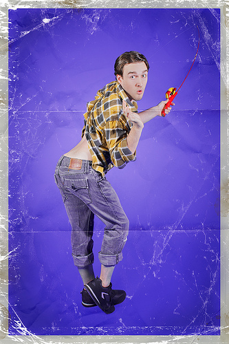
Men-ups is a photo series from photographer Rion Sabean that depict men in classic 1940s-1950s pin-up girl poses. From the pursed lips to the pointed toes to the arched backs, the men in these pictures are absolutely killing it. They create curvy silhouettes and do it with style! The ridiculous poses that barely have anything to do with the 'theme' or 'task' in each picture are a fantastic emphasis on the same poses demanded of women. Perhaps they even call to mind the more modern versions of bikini-clad ladies draped over the hoods of sports cars. I am sad that I didn't order a calendar before they were all sold out.
Dressed to Kill is a blog post by Megan Rosalarian who traced/re-drew women in superhero comics as men. The post has some explanatory text that delves a little into why we shouldn't dismiss the notion that comic books has a sexism problem. But mostly, I go back to this post for the pictures. She keeps the super-muscular male superhero body and it emphasizes... well, everything. The taped-on costumes, the combat-ready high-heels, the poses, the facial expressions, the nearly inaction-hero ways that women are drawn in comics. What's great about this and men-ups is that there is no exaggeration here. While men-ups is very strong because it uses real people, this comic book set may be just a tiny bit stronger on the issue of sexualized poses. Why? Because she pretty much traced. She draw the skeleton of the women in the original picture and then drew the men on top, using that skeleton. It's another situation where the ridiculous poses that women are put into are mocked so easily by just by making a man do it. With just a few pictures, the different expectations between the genders are made readily apparent. With a little giggle from the audience, the whole notion of "let's create an incredible world of super-men and super-women" that still puts these (by definition) exceptional women inside these sexual boxes is called into question.

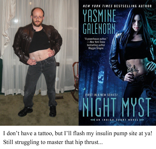
This is a fairly recent exploration on the theme of ridiculous curvature of women's poses on fantasy book covers. (Thanks to @inklesspen for the link!) The spinal contortions are a result of sexist depictions, but the focus here is slightly more on the bonkers anatomy required to pull these poses off. The costumes and the captions by the author are adorable. Real effort was put into these pictures and poses, along with an obvious sense of humour about the whole thing. He finishes off with a more serious note: the back pain he experienced from this photoshoot. (...Okay, I'm a bad person, I even find THAT to be kind of funny.) The author also includes a related link at the bottom of a martial-artist/contortionist discussing women's depictions in comic books. Be warned, the photo of his torso twist is very unnerving.
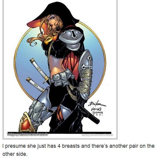
This leads directly into a huge favourite of mine: Escher Girls. Oh wow, do I ever love this Tumblr. I've clicked through and laughed for hours, at least. The author has funny captions and the images are great examples of all sorts of batshit-crazy anatomy. The most prominent, of course, is the double-boobs-and-butt pose.

You can't mention the double-boobs-and-butt spinal twist pose without mentioning Kate Beaton. If you've ever seen anyone mention "Sexism is Over" on the internet, I'd bet money that they are referencing this comic's last panel. The whole set attacks a lot of pieces of the typical "Strong Female Characters" and the whole thing is really funny, if maybe a bit subtle in some of the points it makes. But I think that possibly the best part about this hilarious critique on SFC is the t-shirt sketch follow-up to the comic. Oh my god I must have this shirt. The incredible part is that the front sketch doesn't look wrong. It just looks normal for the illustrations we are used to seeing of women.
Finally, I want to finish off with an examination of our sexual expectations placed on both the male and female body. (Not sure why the Youtube embed isn't working this time. Maybe something to do with VEVO/adviews?) I love everything about this video. When I first saw it I was absolutely in tears with laughter. I still adore it and I can watch it over and over again. But you know what was maybe the best part about this video? The reactions everyone had to the video/song's treatment of the male body and its unapologetic focus on the penis. Scandalous! How dare we find all parts of men's bodies attractive. How dare we focus on their sexuality and the power of sexual confidence. The horror that we would bear witness to such inappropriate costuming. Can you even believe that they would be proud of such an awful, ugly, THING?!
At the time of the video's release, my twitter and Facebook feeds had people recoiling in disgust at the male specimen. Some men that I showed the video to were very uncomfortable and didn't even want to engage in our usual sarcastic banter. They just wanted to... get away, and forget about it as soon as possible. They get squeamish if I bring it up. Articles released around the time described the video as terrifying, kinda disgusting, and overwhelmingly unsexy.
This music video is an incredible mix of using and abusing the gender expectations we've previously established within the medium. The muscle-beach theme, women draped over men, a gang's territory threatened by invaders. The opening of men using their mirror compacts, fixing their hair, and synchronized, scantily-clad back-up dancers. I love the way the dancers all cross their arms and stand defiantly, in a powerful, masculine pose as "the reveal" takes place. I love the way they are all aligned on the beach towels, tanning. (RedFoo is already sunburned, ahahahaha) I love Granny kickin' it in the muscle gang. I love the girls fawning over skinny RedFoo as he lifts, breathing heavily. I love the bodybuilders shaking their heads at the lack of female attention in the presence of RedFoo's relentless confidence. The wiggle-dance-fight is an brilliant take on music videos' love for 'dance fights' between rival teams/gangs. I could just list every scene in the bar-dancing part because the gags are hilarious and the wide variety of body types and genders shown is fantastic. They are all incredible performances and they, along with the rest of the video, collectively embody the confidence of "I'm Sexy and I Know It."
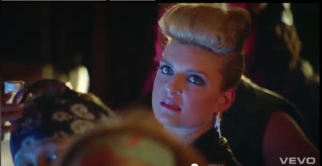
The video is playful, funny, and its gender-reversal of the most prominently exposed bodies in a music video is brilliant. But I'll leave you with this. If there's any moment that deserves a special mention, it's because it's an image that only last a few seconds. I wouldn't want you to miss the chance to really appreciate this while still processing the animal-print speedos.

Amazing.
